maandag 24 december 2012

Happy Holidays!


2012 was a great year for us with lots of games released. We all look forward to 2013, because we know it'll be another year packed with awesome Xform games. Best wishes to all of you and remember...
Keep on playing!

Cheers,
Xform

donderdag 20 december 2012

Xform prevails 12-21

Hey everyone!

If we have to believe the Mayan calendar this should be the last blog of Xform ever!! So they gave me the honour to create the last blog!
But Xform will prevail anyway! Hahaha...

This week is all about the menu and interface of the new race game and no not of Burning Rubber 5, but a race game way cooler than that one!! Ha! I already created some mockup screens a couple of weeks ago. So after the mockup we going to replace the placeholder objects with some self created stuff.


Before

After
As you can see some small things were replaced. For example the background, when I'm creating a mockup screen I use pictures of games/movies, to create a style so I can see what colours I will use. The title of the game in both screens is a working title and will be replaced after the title is final. Here another example.


Before


After
In the mockup screen you can see I used some random pictures as icons and replaced later with our own stuff. A thing we always do, is placing the back button left and the next/continue button right. It’s a thing everyone does, you want to move forward. Same with reading, you read from left to right. So left --> right! Check our previous games and you will see. ;)


Back Button on the left. Next button on the right.


Or in some cases there are no next buttons, for instance if you need to check the How to Play screen.

Back Button on the left.

So, that was it for today!
Now back to work!

Hails!
Eugène

woensdag 19 december 2012

Character Animation II


Hello all!

Today I want to tell you guys something about 3D character animation in our games. Most of our games are vehicle or car based, what has the advantage of not having 3D characters walking around on the screen. I call this an advantage because making games which feature 3D characters, or bone based animations takes more time and effort than games without them.

For the character rigs we use biped and / or CAT-rigs. One has several advantages over the other as well as the other way around. The character in the image below uses a biped skeleton. Each vertex of the character mesh is linked to a bone, or several bones in the skeleton. By transforming (moving and rotating) the bones in 3D space we are able to pose the character.


The animations are done by setting different poses of a character in a sequence, called keyframes. The computer figures out most of the motion between these poses, so we don't have to set every animation frame manually.

When we use 3D animated characters in our games there are usually more than just one character walking around. Think of enemies, friendly's or even maybe another player character. The skeletons ( biped or CAT) we use, have the same structure and names for all of the characters. This allows us to use all of our created animations on every 3D character in the game. A walk animation on one skeleton can work on a slightly different skeleton too. I say slightly different.. Big changes in size of the character or difference in the length of the limbs can affect the motion of the animation. So as long as all characters are roughly the same shape it is possible to use the same animations for them. This reduces the download size a lot, we don't have to export all the animations for each unique character doing so.

Greetings,
Joep

maandag 10 december 2012

Cheating 3D graphics


Hello all!

After working on one of our new racing games Its time to get back to the sniper game and finish up the game. When a game is almost finished it needs to be tested and when that needs to happen we mostly switch to a new game and work on that for a while. This way we get enough time to test the game and gather all the bugs, think for new features or e.g.  simplify the game if it's too hard.

Scrolling score is one of those features that was created during a test session. One of the main aspects of the game is to collect money to improve your team. And to do that you will need to defend your base from waves of enemies. Those enemies will give you money only when they did it wasn't rewarding enough. We heard a sound and we thought we need to enlighten that part a bit more.

So we came up to add a scrolling score. The scrolling score would appear at the enemies position and scroll up and removed after a while in 3D. Only a new problem was created, it needed to be scaled because of the distance between you and the enemy. When you are close or far away it needs to look the same, it can't be too big or too small. And to create a system that would update all the score sign and scale them based on the distance would take more time than just add them in the interface.

But to let them appear in the interface we need a 3d position and project that on the 2d interface. Create a textField on that position and let it scroll. To let this happen we will need to keep track of certain things, the spawn location, timer, scroll offset and which textfield.
The spawn location is needed to calculate the projection to your interface and when you turn your camera or move to a different location we will need a new projection.
With the timer we will know when to disable and remove the textfield.
The Scroll offset, increase each frame and add it to the position.

Greetings,
Michael

maandag 26 november 2012

Cross your t’s and dot your i’s!!


Hey everyone!

At the moment we are busy with finalizing the Sniper game! Testing the game, tweaking the waves of enemies, amount of money and experience that can be earned, making it all shiny and more awesome!!

Last couple of days I did alot of tweaking in the interface and menu, 
checking text fields, duration  of animations, etc.

I also changed some small things in the main menu, a small animation, adding the sniper team in the menu background, load screen and more!
Adding some menu animations to make it more complete. 

and here is how it looks like in flash.


Main menu frame 1


Main menu frame 52
I added some fade-ins,  scaling some things from huge to their normal size.
I also added a small logo animation, a highlight over the logo, what moves from left to right.
Its easily done in flash.  You need the  original text/logo etc, make a mask of that object and add a highlight symbol that animates from left to right! Done!!

You get to see that when the game is released!

Screenshot during test session

Oh, don’t bother the German text fields, we were testing the localization, so the game can be played in more than just one language.


Hails,
Eugène

vrijdag 23 november 2012

Owl-tastic

Bionic owl with gold plating

We're all in an exceptional good mood today here at Xform. Yesterday we won a trophy of a plastic bionic owl!! Ooh-Hooh! We won it at an event called the Dutch Game Awards which is the Oscar equivalent of the game-industry.....in Holland.

We got nominated in 3 categories: Traffic Slam 2 in the category Best Online Game, Red Bull Formula Face in the category Best visual Design and again in the category Best Advergame.

We got the award for Red Bull Formula Face in the category Best Advergame. The Owl now stands proudly in our office overlooking us and keeping an eye out for micewhich occasionally sneak in, let's hope it scares them away.

Red Bull Formula Face
Formula Face is perhaps one of the lesser known Xform game, for a change it's not an action-packet driving or shooting game but a rather casual kart racer in a cardboard paper style.

To get the most out of this game you have to play it with a webcam which makes it possible to control your kart by moving your head and making funny faces.
Spread around the tracks are camera pick-ups which take a snapshot from the player's face in action. These snapshots can be shared on your Facebook account.
You can even print a cardboard cutout model of your avatar and kart! It's a fun little game which can be played herePlease note this game is best played in Internet explorer.

Currently we're having a lot of games in development and I can tell you some of them are very special, let's hope our owl will have a new friend next year.

Matt

maandag 19 november 2012

Fresh snow


Hello everyone!

Today I want to give you guys a quick update about our new stunt game.

Last week we made some decisions about the lighting. In all previous builds of the game we used Unity's lightmapper to bake our lighting. I did this because it was a quick solution to get some baked lighting in. However, we have specific reference images to hold on to. The unity lightmapper is very nice and yes, can give you very good looking results. But in this case, there are very specific colors we want the shadows and shading to be. Therefor we decided to go back to the old fashioned way, baking the lightmaps in 3dsmax.

This meant several things had to be done manually. Such as the unwrapping of the second UV channel. Unity does this for us, which is nice. However again, gives us less control on specific adjustments such as controlling the texel size per poly. This image shows what I mean:

If you look closely you can see that the center of the road ( what is on the screen all the time) has more UV space, and thus, more resolution which gives sharper shadows. The outersides of the track don't need as much resolution, because they never end up being on screen that big. This is not possible to control in Unity out of the box. You're only able to change the texel size per object, not by poly.


The specific colors of the lightmaps are done using gradient maps in photoshop. Gradient maps give accurate color control according to the greyscale value of the underlaying color. Using these gradientmap colored lightmaps in combination with a unlit lightmap shader in unity, we get the exact colors we want.


-Joep

vrijdag 9 november 2012

Dirt Racer

Hi everyone!

After a long time it´s time for something new! I´ve been working on a sniper game for a long time and since that game is in test phase I got something new!
Like most of you know, we at Xform like to make racing game since we, of course, are the best in make those games. So why not make another one!


The project just started 3 weeks ago so we are working towards an alpha release. It´s very important to create good basic gameplay for the alpha, because after the alpha we focus on more content!


In the last 3 weeks I've been working on the basics of the game! We will be viewing the game in birdview so we need some changes to our camera and car behavior. It´s very important to make these mechanics good since we will be controlling the car and camera is following it. When that is finished we need to create some AI! The AI can use the player script for now but less Rays to cast and less check for collision and such. But for now this will do. :)
It will be very important to tweak it very good since we got some physics and lots of AI driving, so we need optimal performance!

Next to driving, camera and physics we need some extra objects... Something to avoid and things to collect like obstacles, pickups, hazards, etc. This is not something that takes long but will if we add to much in the beginning.
 
 
So now you can drive against AI, avoid obstacles, look for pickups and drive through hazards.
With a nice basic menu/interface and some sounds we got ourselves a nice alpha release!
Thats all about our new project!

Greetings,

Michael

woensdag 31 oktober 2012

Managing collisions

Dear readers,

Today I'd like to talk about collisions between objects in physics and how to manage them. Since we finished 'Downtown Drift' (which is now online here and you should definitely play: http://www.a10.com/racing-games/downtown-drift) we've been working on our next game involving lots of cars, explosions and wrecking. During the development of our next game performance became an issue. This was mainly due to there being too many physic objects checking for collisions with other physic objects. In 'Downtown Drift' this wasn't a problem as there really wasn't a lot of collision going on, just collisions between a couple of cars and the street mainly.

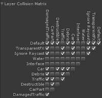
The way I solved this was by creating more layers. In Unity each game object is on a certain layer. Layers are basically a way to group your game objects. Certain functionality can be applied on one or more layers. For instance cameras can be made to only render some layers and not others. Collisions can be controlled with layers as well. Unity allows us to decide which layers should have collision with other layers using the layer collision matrix shown below.


The 'Layer Collision Matrix' in Unity
So instead of putting all game objects on the same layer which would cause collisions to be checked against every game object (that is also a physic object, i.e. a game object with a rigidbody and a collider component), I create multiple layers and set which layers should collide and which shouldn't. Of course this will in most cases affect the gameplay. Although it would be awesome if everything would just collide with everything, it just isn't worth it when your game starts running at 5 frames per second.


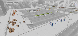
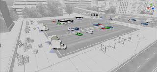
The destructible layer with which the player can collide, but that doesn't collide with traffic.

The traffic layer with which the player can collide, but that doesn't collide with destructibles.
-- Stijn

vrijdag 26 oktober 2012

Total Carnage

We're currently deep into testing and balancing Burnin' Rubber 5, which is quite a task, because it's such a big browser game. A few things have changed since the last versions where we mainly focused on scale. In the previous versions we created loads of tracks and even an open world in Burnin' Rubber 4. This time we're more focused on custom tracks and insane vehicles and weapons.

Besides the well known primary and secondary weapons we now have a new category... the special weapons! These weapons are linked to a bar which slowly fills. When this bar is full your opponents better stay out of your path (if they even can)!! The first unlockable special weapon is the Machinegun Roof Turret, which is exactly that: a machine gun turret attached to your roof.

I think it's better if you just move out of my way!

Imagine this: you're approaching the finish line but you're locked in between four bad-ass opponents. Your chances seem slim. You can try to get around them... but why not use your Machinegun Roof Turret?!
When activated you switch to your first person gun view while the AI takes the steering wheel. Now it's time to shoot those ##@*! out of your way!!!

Taste my special weapon!!! You like that, don't you?

This is just the first special weapon. Later on there are much crazier specials available.
Let the carnage begin!!!

Matt

woensdag 24 oktober 2012

More Guns!!!


Hey everyone!

This week we had a kickoff meeting of a new game!
No more machine guns, sniper rifle’s or that kind of stuff. Something new:
A kick ass racing game! Not sure If I can tell you much about it, so I keep it short.

Last couple of weeks I have been working on the sniper game, some small changes here and there, tweaking the waves etc etc. And making one of the last weapons!!

In the mean time the intern called Chris has been working on that particular race game.
We needed a vehicle, a race track and some new assets. So when we start developing the race game we got some good material to work with. He made a good start and we will definitely show everyone this later!

Back to the weapon! I started with searching for reference. I wanted to make a weapon different than the others,  with a more futuristic style.

I started modelling the basic silhouette.


From there on I add more detail on the silhouette of the mesh, to define the different parts of the rifle. The barrel, the ammo box, the hand grip etc. 


After that I added some detail, a fancier barrel, some detail on the top of the weapon. I also added a scope. I want this weapon to be able to zoom. Would be looking odd if the weapon could zoom and didn't had a scope...


When the mesh is complete and the unwrap is done,  it's ready for a light map and a diffuse map.

Here the preview of the weapon with the diffuse map:


When all is done! The fun part begins: getting it into the game! And shoot with it! Ha!

Hails!
Eugene


vrijdag 19 oktober 2012

Another winter is coming...

Hello everyone!

A few weeks ago I started working on another new project together with Stijn. It is going to be a stunt game taking place in a winter setting. This may sound familiar to some of you who have played our game 'Freestyle Snow Wheeling'. For now I can spoil that this project won't feature any drivable cars ;).

As always we start with a mockup version of the level. The mockup is used to define the scale and general design of the level. I started by creating a basic road which goes downhill slightly. Stijn made an early test version of the game where I was able to test the road in-game.

Once I was happy with the width of the road I started placing some of the building assets which were made by our interns. Something I find quite challenging when creating a city kind of environment is the distance between the street and the buildings. This may sound very simple, just place 'm along the road what feels good. However when looking at it from an in-game perspective it can feel very 'clamp' when they are placed just a little too close to the street. 

After placing the buildings I started adding some foliage and other/smaller objects to define a bit more of the setting. This can be quite time consuming sometimes, also this environment in particular was quite big/long. I also made a quick lightmap for the scene using the unity lightmapper.


That's all for now.. Next time I want to show you guys some more pictures of this new project.

Greetings,
Joep

vrijdag 12 oktober 2012

GUNS!!!

Hi, everyone!

We are still very busy with the our new game! The end is near, but we got a lot of unfinished business... There are some minor changes, but it cost a lot of time to make those changes. Since the essence of the game is shooting we (you guess) have a lot of weapons, so a lot of settings to make those weapons very unique...
We got 3 types of weapons and within each type there are several different guns you can buy. It would be a little bit odd if we let you buy a gun that isn't different than the lower classed weapons. So these weapons need be unlocked by playing the game and by leveling up as a team! So when you manage to neutralize all enemies you will unlock new weapons.

Different ammo upgrades


To make all weapons feel unique we need to make all stats dynamic. So when someone wants to change the rate of fire or the reload speed of a machine gun he needs to be able to change it.
So it's very important for me to implement it from a text file that will be loaded into the game. That way we can easily manage all these stats and change them on each run. Would be better to change it during the game, but we are not able to do that, yet. :) We can't make guns with only 1 tweakable stat, so we need a lot. Think of damage, damage type, bullet, rate of fire, reload speed, amount of ammo, zoom (and if it does: how far..) With those (and more) we can make a lot of different weapons. :)
Easy to think of, but a hell to manage and tweak them to make it unique! Which weapon needs more damage? And why should that one need more? But what when it has too much damage and to much ammo?.. Lots of stuff we need to think of before tweaking it!

How to tweak this gun?


The important part of those stats is that you need a beginning and an end point, so when you got 5 weapons of 1 type, your beginning point (lowest) will be the first one and the end point (best) the fifth one. So it's easier for you to make the weapons different from each other.

 Like this gun, with its zoom and ammo upgrade maxed out! I think everyone would like this!

How much damage will this one do?


Greetings, Michael

vrijdag 5 oktober 2012

So you wanna be an Xform fan?

Great news for all of you who haven't been reading our Facebook- and Twitter posts the last days:
Downtown Drift is released!

Play it here: http://www.a10.com/racing-games/downtown-drift

One of the Hourly Challenges in Downtown Drift

Yes, Downtown Drift is the name of 'another racing game' with 'loads of cars' Stijn and Joep wrote about before.
The game is fully packed with cars (more than 20!), races, time trials, crash courses and daily challenges. And because this is our first big and completed Unity game we're really proud of it!
You can play the game for a week now and it seems that the A10 and Agame.com audience love it:


It's always nice to read positive comments like this, but it's even more fun if we see that players are starting to create their own fan art and YouTube videos, based on our game.
The last months Facebook we build up a dedicated fan base by our Facebook page and one of our biggest fans created this video:


Do you like to see some more? We've collected all other Downtown Drift videos and created this playlist. :)

As I mentioned in another post, we really love our fans. We like to read what they think of our games and, we like watching their walkthroughs and we love to see how they model their own Burnin' Rubber cars! The more, the better! It's never enough.

So with this post I like to challenge you! Show us that you are a true and dedicated fan of Xform Games and post your fan art and YouTube video links here: https://www.facebook.com/Xform

And for those fans who are waiting for Burnin' Rubber 5... we have a special challenge coming up soon!

Cheers and have a great weekend,
Shirley

vrijdag 28 september 2012

Quick and dirty menu image

This week I created some menu background images for the sniper game we're currently developing.
Because of a closing deadline I only had about four to five hours for each image.

In this blog I'll explain how I've created the image for the main menu. Because of the limited time I decided to only use the low poly 3D in-game assets.
I made a copy of Eugene's city game environment, added a camera and played around with it until I was happy with the camera view.

I decided to render the image's lighting in separate files, so I could easily adjust the lighting and shadows in Photoshop. This can save of a lot render settings tweaking time while making the Photoshop file much more flexible.

First I rendered a diffuse map set to full emissive, resulting in an image without shadows. Looks ugly doesn't it?

Next I placed a direct light and only rendered this light's dropshadows:

I used a default skylight for this render:

Finally I rendered an occlusion map which only creates dark inner corners:

All images are imported in Photoshop and placed all layers on top of eachother, using different blending styles. This creates the image below:

I found a suitable sky- and city skyline using my google skills, did some color correction on it and pasted it in a layer behind the city renders:

In the next step I added some fire, smoke, dirt and jets to the scene:


In the final step I did some color correction, added lighting effects and a faint blur around the canvas edge. The final result can be seen below:


That's it! The image is done in just a few hours.

Cheers,
Matt